


India’s Inequality Debate Misses The Point
In the inequality conversation, there are many nuances that are often ignored.


There’s been a lot of chatter online about inequality in the Indian context. About a year ago, Thomas Piketty published a paper showing that inequality in India today has eclipsed the magnitude of inequality during the British Raj. Piketty is often associated with leftist thought and I find the comparison to be insensitive. Further, Oxfam recently published a report where they reported that the richest 1% in India controlled 40% of total wealth.

Oxfam likes to wave about the following claims:
The top 10% of the Indian population holds 77% of total national wealth.
Billionaires’ fortunes increased by almost 10 times over a decade and total wealth is higher than the Union Budget of India.
It would take about 950 years for a minimum wage worker in rural India to earn what the top paid executives earn.
Piketty and his co-authors claim the following:
The top 1% of Indians hold about 25% of total income and 40% of all wealth.
The top 1% share of income in India is higher than the US, Brazil or South Africa. That makes it one of the most unequal countries in the world.
The tax code is regressive when viewed from the lens of net wealth.

Rebutting these claims, Gautam Chikermane from the Observer Research Foundation, published an editorial claiming that according to the Gini Index, India is the world’s 4th most equal country. Only Slovakia, Slovenia and Belarus have lesser inequality than India.
How can all of these claims be squared up at the same time? To understand that, I want to take some time to clear up some misconceptions about wealth and inequality in this post. Once the methodology behind these statistics is understood, the credibility of these claims becomes clearer.
Income Inequality among statistical categories
Whether it be India or any other Western country, income statistics of the form “X% of people have Y% of wealth/income” are present. X is usually a number less than 10 and Y tends to be a number greater than 50.
The mistake here is to compare abstract categories and map them on to people. So for example, until people turn 21 years old and get their first job, their share of income in the economy is usually 0%. The retirement age in India also tends to be somewhere around 60.
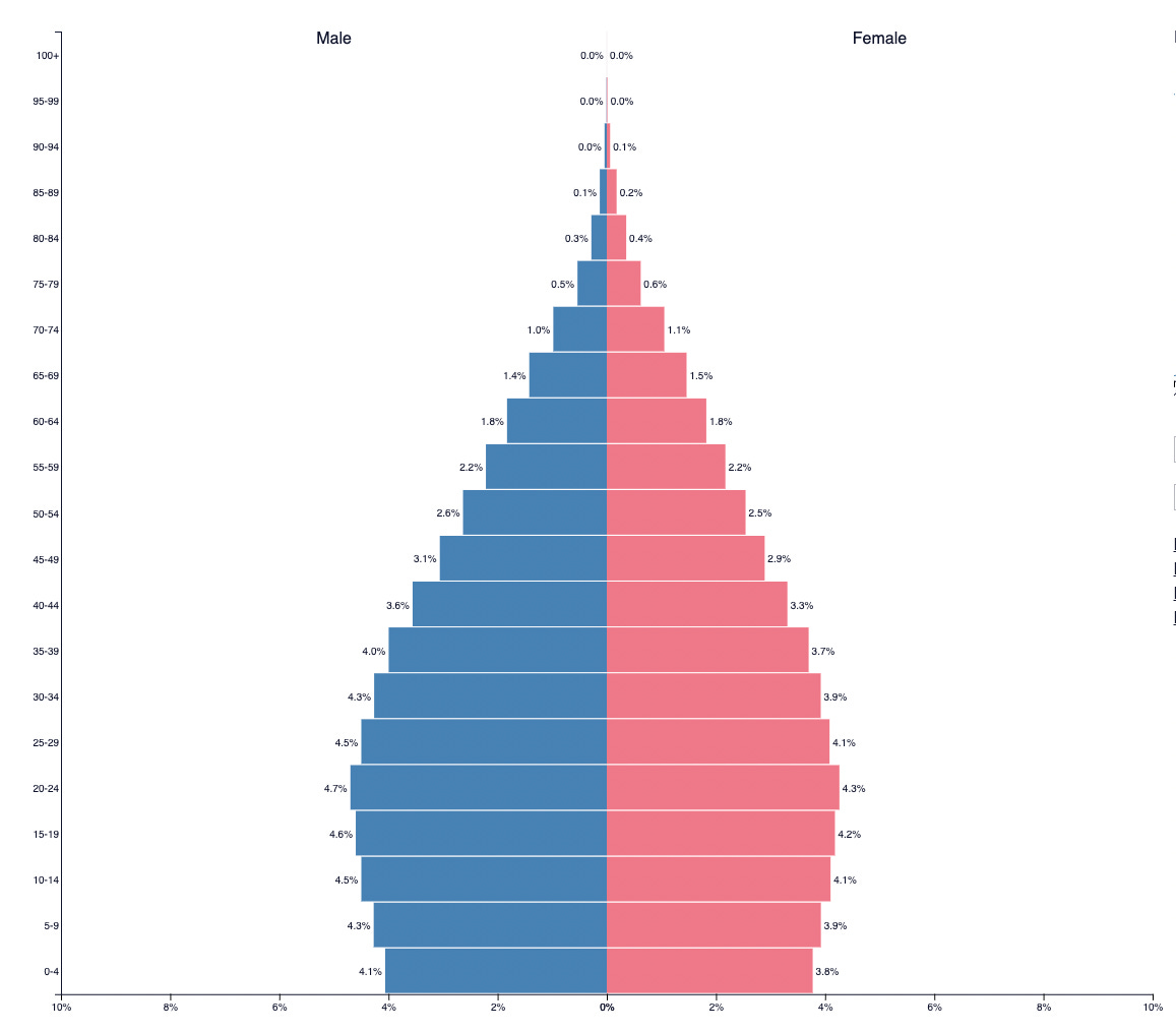
The image of the population pyramid I posted above shows that about 30% of the population is earning nothing. Generally in such a case there’ll never be income inequality. Many studies do correct for such errors. But there’s another nuance here. As people grow older and gain more experience, they’ll naturally command higher salaries. The implication is that a youthful employee starting out his career at the age of 21 might earn multiples of that at the age of 55. This would be the case in any healthy economy and is desirable.
This might not happen in two scenarios:
There’s no demand in the economy for specialized skills and experienced workers. That’s probably because the economy isn’t specialized enough.
The person isn’t upskilling throughout their career.
Both these cases are undesirable, but inequality measures like the Gini coefficient and Piketty’s measurements would show inequality declining. A subtle point here is that any economy should make the tradeoff of having a high floor of income even if it means that the income ceiling rises disproportionately. Does it really matter that billionaires’ incomes are rising if wages and incomes are also rising proportionately?

The same mistake is made by the Indus Valley Report published by Blume. India 3 comprises 1 billion people. It’s likely that about 300 million people in India 3 are either below the age of 21 or above the age of 60. This isn’t to brush away concerns about wage growth and job creation. There are issues with rural wage stagnation but the methodology to study this must be properly vetted. Such reports only serve as launchpads for homilies by the usual suspects.
In the US, a 2007 study by the Department of Treasury tracked individuals’ income mobility through their income tax returns over a decade from 1995-2005. Among other findings, what caught my eye was:
Roughly half of the income tax payers who started out in the bottom 20% in 1996 moved up to a higher income group by 2005.
Of the top 0.01% in 1996, only 25% remained in this group in 2005.
To study inequality thoroughly, there needs to be a similar study across time rather than a snapshot of the current state of affairs. If economic mobility across income quintiles is high, then inequality becomes less salient. Unfortunately, I wasn’t able to find any similar studies or data for India.
Wealth Inequality among the population
Wealth is even more nebulous than income. There’s a common perception that billionaires hoard wealth like a dragon like Jeff Bezos in the meme below. But taking a look at the components of their wealth shows that their wealth is heavily concentrated in the companies they own or have founded. Organizations like Oxfam will allege that their stake in companies gives them monopoly power. For example, one of their claims is that Amazon “accounts for 80% or more of online purchases in Germany, France, UK and Spain”. That isn’t monopoly power though. If the cost of online purchases exceeds those from brick-and-mortar businesses, consumers will gravitate towards those businesses. So by definition that doesn’t make it a monopoly.

Oxfam’s methodology to compute wealth consists of subtracting debt from assets. At first glance, that appears to be reasonable. On digging deeper, it results in absurdities like there being more poor people in the US than in China. Similar absurdities result when this methodology is applied to other countries like India.
Usually, when individuals start out in life, they’ll accumulate tons of debt. Education loans, car loans, housing loans among others will be greater than assets for probably the first decade and half of one’s career. That’s desirable in a healthy economy. It shows that enough people have confidence in the economy to invest significant years in building up human capital. Once they grow older and pay off their debts is when assets start to accumulate. That’s the pattern followed across all healthy economies in the modern world. An economy where this is absent will have lower levels of wealth inequality, but will likely be a less desirable place to live. A good example is that the United States is more unequal than Pakistan when measured by the Gini coefficient. I don’t see anyone clamouring to go live in Pakistan just because everyone is equally poor.
Just as with income, the same mistake is repeated here. The concentration of wealth is often a bigger problem than its made out to be. What we’re interested in is the probability of someone navigating to the higher wealth quintiles than the one they were born in. A quick glance at billionaires in India and elsewhere in the world proves that this could be true. Many billionaires at present weren’t born into wealthy families. Sure, their families were well-off and could afford to invest in their human capital. But with that push, they were able to catapult themselves into the billionaire class.
Finally, let’s look at Oxfam’s methodologies to compute wealth inequality:
It estimates wealth distribution across each country’s population. Owing to a lack of wealth distribution data, most wealth models estimate wealth distribution patterns using income distribution data. Wealth-X’s proprietary database of millions of records on the world’s wealthiest individuals enables it to construct wealth distribution patterns using real, rather than assumed, wealth distributions, making the model more reliable. It then uses the resulting Lorenz curves to distribute the net wealth of a country across its population. The database is also used to construct investable asset distribution patterns across each country’s population. The model uses residency as the determinant of an individual’s location. (emphasis mine)
There are numerous problems here:
Income distribution data itself is flawed. Using it to estimate the distribution of wealth data is analogous to building castles on sand.
The Lorenz curve has significant limitations. One of the major ones that it is often a temporal snapshot. That is, a snapshot at one moment in time. A college student will be temporarily poor until he earns his degree and he’ll become wealthy in a couple of decades. But the snapshot of the category he’s attached to will show no difference. It will look as if inequality is constant.
Another problem with using the Lorenz curve is that ultra-wealthy individuals can distort the curve. That’s like an extremely tall person pulling up the average height in a basketball team. It might not be what the typical person experiences as inequality.
As I mentioned earlier, measuring wealth is nebulous. Valuing assets like private businesses, real estate and collectibles involves significant uncertainty. High net worth individuals often have multiple tax residencies and wealth is often distributed across such residences.
Adding to it, Oxfam’s claim that they use “real, rather than assumed” wealth distribution is problematic. Wealth by nature is highly secretive. Do they have independent verification mechanisms? I highly doubt it.
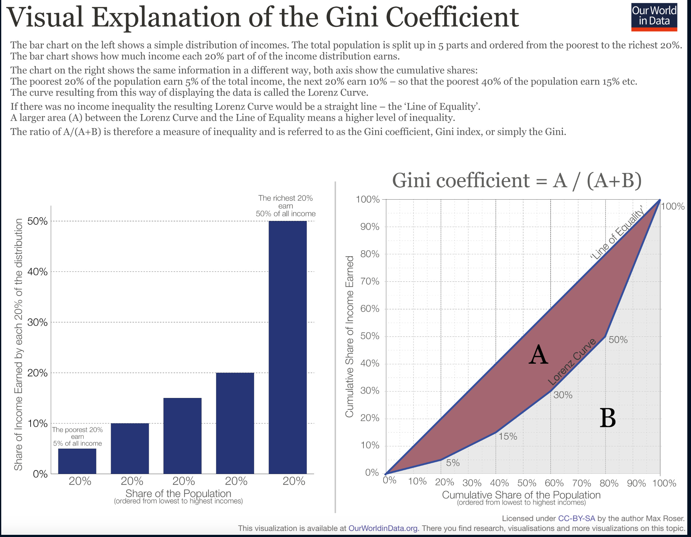
The Gini index
The World Bank favours using the Gini Index to measure inequality. The coefficient goes from 0 to 1 where 0 corresponds to perfect equality with everyone sharing the same income and 1 corresponds to perfect inequality where one person has grabbed all the income.

Recently released data show that India is the 4th most equal country only after Slovakia, Slovenia and Belarus. As I mentioned earlier, inequality isn’t the whole story. In the above graph, the lower the coefficient, the better. Pakistan has the lowest Gini coefficient among all the economies I’ve chosen on the graph. And yet, I doubt anyone reading this is rushing to pack their bags to leave for Pakistan. The previously mentioned Lorenz curve is often used to calculate the coefficient.
Rather than try to explain the methodology myself, I chose to use an infographic from OurWorldInData that does a great job demystifying the index.
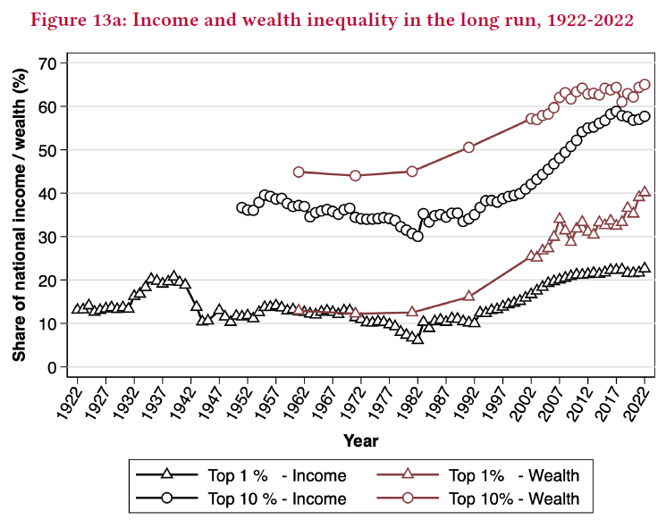
Another great way to visualize inequality is the by seeing the proportional change in inequality over time. The graph below shows a set of 5 countries (US, France, India, Uruguay, Pakistan) and how the Gini coefficient, the share of top 1% and the share of top 10% have changed over time. The source for the data is the World Inequality Database which had been created by Thomas Piketty and his co-authors back in 2013.

While the top 1% in India have had their incomes rise, the top 10% have also seen increases. When we remember that these are categories and not blood-and-flesh individuals, the picture becomes rosy. It implies that as long as economic growth continues, someone who is starting out today will see more wage growth and therefore accumulate more wealth before finally retiring from the workforce.
Executives earn 950x times the worker’s wage
Oxfam has claimed that in India top executives are paid what their lowest paid workers would take hundreds of years to earn. There are different forms of making the same claim. On X (formerly Twitter), Jairam Ramesh claimed that the median earning of the top 10% is 13 times higher than that of the bottom 10%. There are a number of holes in this logic, some of which I’ve covered earlier:
The 13x gap between the top and bottom 10% reflects the premium the market places on skills and productivity. A skilled software engineer can often multiply the pace of execution of a project by 10x. Wouldn’t the engineer command a handsome premium? Similarly, senior managers in their company have multiple resources under their command that they utilize to deliver value for the company. Those managers which add the most value to a company’s business command pay commensurate with their skills.
The gap also reflects natural life cycle patterns. Sowell puts it pithily: “Who should be surprised that 60 year-olds have higher incomes and more wealth than 30-year olds?”
A converse to the previous point is that these statistics are only a snapshot in time. Following the trends of income brackets creates the illusion of following people.
For a modern executive or a CEO, the complexity and scope of their responsibilities far eclipses those of previous generations of executives. Executives often require expertise in tech, economics, global financial markets and much more. The high compensation reflects the scarcity of individuals capable of managing large, complex organizations. If such individuals were commonplace, then the supply would push down wages. That the wages are high reflects the willingness of stockholders (who tend to be retail investors) to pay such compensation.
And finally, greed is not the reason for high salaries. CEOs salaries depends on what stockholders and board members are willing to approve. They could be the greediest people on earth and it wouldn’t affect their pay in the slightest. On a related note, who isn’t greedy for earning more salary? I’ve yet to meet a single person who thinks they are being greedy for the salary they’re asking. Especially when so many people go hungry every night.
In Marxist thought, there’s often an emphasis on equality of outcomes rather than equality of opportunity. In life, disparities are the norm rather than equalities. A society must ensure that these disparities aren’t the result of discrimination. Once that constraint is satisfied, outcomes are outside the control of any institution.
My favourite example is that of birth-order effects. In the US, firstborns from families were more often finalists in National Merit Scholarships compared to their siblings. A family generally provides equal opportunities, and yet equal outcomes weren’t guaranteed.
I hope that’s enough to show that the conversation on inequality is much more nuanced than what comes out in headlines. I’ll be writing a sequel to this post where I point out flaws in Piketty’s methodologies in his paper on the Billionaire Raj.
# The Inequality Red Herring: What India's Development Discourse Gets Wrong
The real question confronting India's intellectual class is whether all this inequality debate has been fruitful in the slightest. The answer, I submit, is a resounding no.
China, even by official statistics, exhibits inequality levels comparable to America. Do most Indians not regret forgoing China's development path in the 1980s and 1990s? Today, even China's poorest provinces surpass India on a per capita basis—a sobering testament to the opportunity costs of India's developmental choices.
Regarding poverty reduction, economic growth maintains a 99% correlation with poverty alleviation. This is not mere academic abstraction but observable reality.
Consider a more salient, earthbound fact: cities consistently exhibit greater inequality than villages, yet people migrate from villages to cities in vast numbers. This reveals what people actually value—their absolute standard of living rather than their relative position among neighbors. Actions, as always, speak louder than words.
The disconnect becomes even more apparent when examining survey data. Indians appear remarkably unconcerned with inequality, a finding that should surprise those who consume Indian media discourse. The Indian media class acts as though the citizenry consists of jealous ideologues, but perhaps this reflects merely the pathology of India's middle class rather than any genuine popular sentiment.
The obsession with inequality serves primarily as intellectual masturbation—a distraction from the harder work of wealth creation. While India debates relative positions, entire provinces elsewhere have lifted themselves from poverty through the simple expedient of growth. The poor, it seems, prefer prosperity to equality.
Good read. I remember reading a piece by Bryan Caplan which tried to demonstrate that people don't actually care about inequality. Found the piece pretty convincing.
The goal with such inequality pieces is very often not scientific enquiry but rhetorical persuasion. As such they fall to even the most basic informed scrutiny